The Psychology Of Color In Pixelart Gaming
Pixel art has been an integral part of video game visuals since the early days of gaming. The limited graphical capabilities of early gaming systems meant developers had to get creative within tight technical constraints. One way they added visual flair was through intentional, strategic use of color palettes and limitations. The stylized, low-resolution pixels of classic games are instantly recognizable and nostalgic. They reflect the technical realities of the past, but also the artistry and creativity developers brought to their craft. Pixel art games made up for their rudimentary graphics with expressive uses of color to set moods, convey themes, and craft iconic styles. Their careful attention to color made these games visually engaging despite technical limitations. This article will explore the history and psychology behind pixel art’s distinctive approach to color in gaming.
According to research, pixel art games date back to the earliest days of gaming in the 1970s and 80s (Source). Classic examples like Grindcraft demonstrated how color could bring retro pixel graphics to life (Source). Pixel art persisted even as technology advanced, thanks to its nostalgic aesthetic. But this style was born out of necessity, not pure artistic choice. Game developers made the most of color palettes despite limitations. Their ingenious use of color with limited technical means is part of what makes pixel art special.
The Basics of Color Theory
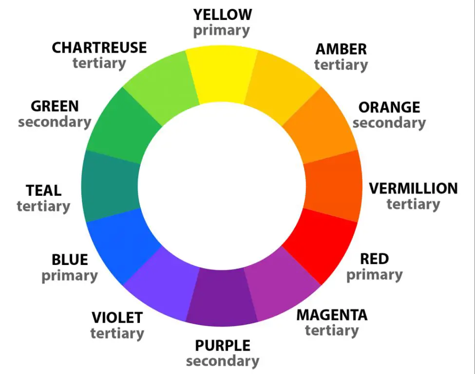
Color theory is based around the color wheel, which consists of primary, secondary, and tertiary colors. The primary colors are red, yellow, and blue. When you combine two primary colors, you get the secondary colors of orange, green, and purple. When you combine a primary and secondary color, you get the tertiary colors like red-orange, yellow-green, etc. Understanding how these colors interact to create harmony and contrast is the foundation of color theory.
The color wheel illustrates how colors relate to each other. Complementary colors are located opposite each other on the wheel, like red and green. These color combos create high contrast. Analogous colors like blue, blue-green and blue-violet are located next to each other on the wheel and create harmony. Warm colors like red, orange and yellow evoke energy and heat. Cool colors like blue, green and purple suggest calmness and tranquility.
Knowing the relationships between colors helps designers combine hues for aesthetically-pleasing palettes. It also allows artists to intentionally use color combinations to evoke certain moods or emotions.
Color and Emotion
Color can evoke powerful emotional responses in people. This psychological phenomenon is known as color psychology or chromotherapy. Certain hues are associated with specific feelings, moods, and meanings, often due to cultural conditioning and personal experiences.
For example, warm colors like red, orange, and yellow are often described as energetic and exciting, while cool colors like blue, green, and violet feel calmer and more serene. Bright, vivid colors tend to feel playful and youthful. Darker, grayer colors can come across as sophisticated or moody.
In color psychology, red is associated with passion, energy, and danger. Blue evokes peace, trust, and professionalism. Green represents nature, health, and stability. Yellow stimulates cheerfulness and creativity. Purple connotes luxury, spirituality, and imagination.
Game developers leverage color psychology to elicit certain moods and reactions. A child-friendly game may use bright, warm hues to feel playful. Horror games often rely on darker, muted colors to create unease. Pixel art allows devs to carefully choose a limited color palette to precisely evoke the desired tone.
Using Color to Set a Mood
In pixel art games, color palettes are often carefully chosen to match the intended mood and emotions of the game. Warm colors like red, orange, and yellow can elicit feelings of energy, intensity, and anger. Cool colors like blue, green, and purple evoke a more calming, melancholy, or mysterious vibe. Selecting colors that align with the game’s theme is key for establishing the right atmosphere.
For example, an action game with a dark fantasy theme would likely incorporate lots of blacks, grays, deep reds, and muted greens to help set an ominous, gritty mood. On the other hand, a lighthearted adventure game may use bright, saturated colors like yellow, pink, light blue, and purple to create a fun, whimsical feeling. Strategically using color gradients can also help denote transitions from safe to dangerous environments.
Testing out different color palettes during the design process is important to find the right balance of hues that bring out the intended emotions. The psychology of color should be just as integral to pixel art as the actual pixels. As this article points out, color can be used to guide the player, create contrast, and tie the visuals together.
Color Palettes in Retro Games
The use of color palettes in retro pixel art games was constrained by the technological limitations of the time. Early consoles and computers could only display a small number of colors. For example, the original Game Boy could only display 4 shades of green. The NES could display 25 colors and the SNES had a palette of 512 colors. Game developers had to carefully choose color palettes that worked within these restrictions.
Despite the limitations, classic pixel art games made ingenious use of color to set mood and establish visual styles. The saturated primaries used in Super Mario Bros evoked a joyful, cartoon-like world. The moody blues in Metroid created a creepy sci-fi atmosphere. The black background in Game Boy games like Tetris allowed the pixel art and colors to pop. Analyzing famous retro color palettes provides insight into how developers created visually engaging graphics.
Certain genres came to be associated with specific color palettes. For example, the green hues in the original Legend of Zelda established the adventurous, vibrant style seen in later entries and throughout the action-adventure genre. Sci-fi games like Metroid and Contra frequently used darker palettes with neon pops of color. Looking at examples of color palettes used across retro pixel art games shows how genres developed distinct visual styles through strategic use of color.
Color Limitations and Creativity
A key aspect of pixel art is working within the tight constraints of limited color palettes. Early consoles and computers only supported a small set of colors, often 16 or fewer. This presented pixel artists with a creative challenge: how to represent complex images and settings using a restricted number of colors (1).
Having to work within such severe color limitations pushed pixel artists to get creative with dithering, color blending, and shading techniques. By carefully choosing a small set of colors and blending them together, they could create the illusion of many more colors than were actually possible on the hardware. The most skilled pixel artists turned the limitations into an advantage by developing signature styles defined by their ingenious use of limited color palettes.
Even today with far more advanced technology, deliberately limiting color palettes remains a defining characteristic of the pixel art aesthetic. Contemporary pixel artists intentionally restrict their color options, which forces innovative solutions. Working under tight creative constraints summons ingenuity and vision. Pixel art’s origins in low-color hardware instilled that mindset of working creatively within limits that still permeates the art form today.
(1) https://www.yurishwedoff.com/how-many-pixels-is-pixel-art-exploring-the-dimensions-of-digital-art/
Color to Establish Branding
Many of the most well-known retro games use strong, iconic color palettes that establish a sense of branding and visual identity. For example, the bright red of the Mario character establishes an instant connection to Nintendo’s Super Mario franchise. Similarly, the deep blues and dark backgrounds of the Metroid series immerse players in a moody, atmospheric science fiction world. Using a limited color palette allowed developers to create a visually cohesive experience across sequels and establish their game worlds as distinct brands.
The striking oranges and blues of Portal reflect the game’s clinical but surreal testing environments. The vivid green grass and deep blue water create an immersive world in the Legend of Zelda games. Establishing this visual identity across games helped players instantly recognize sequels and connect with each game world.
Pixel art games especially rely on strategically chosen palettes to convey a look and feel. The garish neons of 1980s arcade games beam with energy, while the earthy tones of Stardew Valley create a peaceful, pastoral mood. Restricting the color palette focuses the visuals and creates an artistic style players associate with that game or franchise.
Color and Nostalgia
Pixel art and the limited color palettes of early video games are deeply intertwined with nostalgia for many gamers. Using those iconic retro color schemes and palettes is a powerful way to tap into gamers’ nostalgia for the games they grew up playing (Museum of Play, 2015). The blocky, pixellated graphics and bright, saturated colors of games like Super Mario Bros., The Legend of Zelda, and Sonic the Hedgehog left an indelible mark on a generation of gamers.
Part of pixel art’s recent resurgence and popularity as an aesthetic choice is undoubtedly tied to this sense of nostalgia. As one Reddit user noted, “There’s been a wave of pixel art nostalgia for the past 10+ years. There have been some high-profile games with a retro aesthetic that appealed to older Millennials consumed by nostalgia for their childhoods playing SNES/Genesis” (Source). By embracing those classic 8-bit and 16-bit color palettes that evoke warm nostalgic feelings, pixel artists and game developers can establish an instant connection to many players.
Accessibility Considerations
When designing pixel art games, it’s crucial to consider accessibility for colorblind gamers. Approximately 1 in 12 men and 1 in 200 women have some form of color vision deficiency. The most common condition is red-green color blindness, which makes it difficult to distinguish between red and green hues.
Some tips for making pixel art games more accessible include:
- Avoid relying solely on color to convey critical information. Use shapes and patterns as well.
- Allow users to adjust individual color schemes. This lets players customize colors to suit their vision needs.
- Don’t just grayscale the design. Pick distinct colors that are visible to most types of colorblindness.
- Use high contrast between foreground and background elements.
- Test with online colorblindness simulators to check contrasts.
Many pixel art titles now include colorblind modes and palette adjustments. For example, the roguelike game Roguelight allows switching color filters to increase visibility for different types of color vision deficiencies. By considering accessibility early in the design process, pixel artists can make their creations enjoyable for all players.
The Future of Color in Pixel Art
Advancements in display technology like OLED are allowing for richer and more vibrant colors in pixel art games. OLED screens have pixels that emit their own light, allowing for truer blacks and more saturated colors compared to LCD displays. This opens up new creative possibilities for pixel artists to use a wider gamut of colors and more subtle gradients while retaining a retro pixelated look.
As this article discusses, the creators of the pixel art game Owlboy believe the future of the art form is bright. New tech allows artists to evolve pixel art while still embracing limitations. Color can be used in more nuanced ways to set mood and emotion. At the same time, restrictions foster creativity.