Pixelart Ui Design For Beginners: Creating User Interfaces
Pixel art user interfaces (UIs) refer to graphical user interfaces made using pixel art techniques. Pixel art is a form of digital art where images are created and edited at the pixel level. According to Wikipedia, it is “a form of digital art, created through the use of software, where images are edited on the pixel level.” (https://en.wikipedia.org/wiki/Pixel_art)
The history of pixel art interfaces traces back to the earliest computer graphical user interfaces in the 1970s and 80s. When home computers like the Commodore 64 became popular in the 1980s, pixel art was used out of necessity to create the limited graphics those early systems could display. Early pixel art interfaces from companies like Xerox PARC laid the groundwork for many common UI conventions still used today. According to DeviantArt, “In search of the first GUI we have go to 1969, when the Xerox Palo Alto Research Center came to life. Xerox PARC has been the inventor and pioneer of the GUI as we know it.” (https://www.deviantart.com/uszatyarbuz/journal/Introduction-to-the-History-of-Pixel-Art-615671612)
Pixel art UIs are defined by their low-resolution, blocky aesthetic that harkens back to those early computer graphics. Their distinct visual style embraces limitations, using intentionally large pixels and a restricted color palette. This can lend pixel art interfaces a charming retro appeal. However, it also introduces constraints for legibility, usability, and accessibility.
Principles of PixelArt UI Design
PixelArt UI design requires focusing on simplicity in order to create clean, legible interfaces. Here are some key principles:
Focus on simplicity – Avoid clutter and only include essential interface elements. Streamline workflows and minimize the steps users need to take.
Limit color palette – Stick to just a few colors, often 16 or less. Too many colors can make the interface chaotic. Choose a cohesive palette.
Use clean geometry – Favor geometric shapes and grid-based layouts. This creates order and improves consistency across the interface.
Make interfaces legible and intuitive – Use principles like contrast, repetition, and clear visual hierarchies to enhance usability. Icons and text should be easy to decipher.1
Tools for Creating PixelArt UIs
When getting started with pixel art UI design, choosing the right tool is crucial. There are many software options available, each with their own strengths and weaknesses. In this section, we’ll provide an overview of the leading tools for pixel art UI creation, comparing their pros and cons to help you determine the best choice for your needs as a beginner.
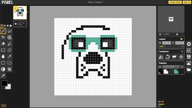
Some of the most popular pixel art software options include Photopea, Piskel, Aseprite, and GIMP. Photopea is a free online editor with powerful features like layers and animation support, making it a top choice for beginners. Piskel is also free and browser-based, focused onsprite animation. Aseprite is a paid desktop app built specifically for pixel art, offering specialized pixel-perfect tools. GIMP is a free, open-source raster graphics editor with a steep learning curve but extremely robust capabilities.
When evaluating pixel art software, some key factors to consider are: cost, learning curve, feature set, platform (desktop vs browser-based), and specialization for pixel art vs general graphics editing. For brand new beginners, free or low-cost browser-based tools like Photopea and Piskel are recommended to start. Their simplicity and automatic pixel snapping allow you to focus on the fundamentals. More advanced options like Aseprite and GIMP provide greater control once you’re comfortable with pixel art basics.
Overall, Photopea and Piskel are likely the best pixel art tools for complete beginners to start with. Their simplicity, gentle learning curves, and free access make them ideal for getting your feet wet with pixel art UI design.
PixelArt UI Design Process
The process for designing a pixel art UI generally involves several key steps:
Planning and Wireframing – This involves sketching out the overall layout and flow of the UI screens and interfaces. Creating simple wireframes helps define the structure and functionality before getting into visual details. This article outlines a 10 step UI/UX design process that includes planning and wireframing as critical first steps.
Designing Layouts and Screens – With wireframes defined, the visual layout and appearance of screens and interfaces can be designed. Consideration is given to information hierarchy, flow, and usability. Bold, iconic designs are common in pixel art UIs.
Choosing Color Palettes – A key aesthetic decision is selecting a color palette that fits the visual style. Pixel art palettes often use a limited range of bold, saturated colors. Palettes should be cohesive while allowing key elements to stand out.
Creating Interface Elements – Pixel art assets like buttons, icons, and UI components bring the interface to life visually. Elements should be legible and consistent across screens. Animated elements can add interest when appropriate.
Testing and Refining – The pixel art UI should be tested with users to identify any usability issues. Iterative refinement helps polish visual details, interactions, and layouts.
Asset Creation Tips
Creating high-quality pixel art assets is key to a polished, cohesive UI design. Here are some strategies for drawing clean pixel art:
Use a limited color palette, like 4-5 colors maximum. This helps maintain consistency across assets and gives your UI a unified aesthetic (Source).
Keep your assets small and simple, aiming for recognizable silhouettes and icons. Complex pixel art can become visually noisy.
Maintain hard edges and avoid anti-aliasing. The crispness makes your assets read well at low resolutions.
Use outlines and high-contrast colors for visual pop and legibility.
When creating icons and buttons, design them modularly so they can be combined and rearranged. Maintain consistent proportions across elements.
Export your assets at the target resolution without interpolation or smoothing. Keep them pixel-perfect.
By following pixel art best practices, you can produce clean, scalable assets that bring your UI to life.
Animating PixelArt Interfaces
Animation can bring pixel art interfaces to life and make them feel more engaging and dynamic. Here are some tips for effectively animating UI elements in a pixel art style:
Use simple animation principles like squash and stretch, anticipation, follow through and overlapping action. These will make movements feel more natural. For example, a button could squish down slightly when pressed before returning to its normal shape.
Avoid over-animating. Subtle and sparing animation is best for retaining a clean pixel art aesthetic. Animate key interactions but don’t make everything move at once.
Focus animation on transitional elements like menus, load screens and scene changes. Use subtle movements like sliding, fading and zooming instead of flashy transitions.
Animate primary call-to-action buttons and icons more than decorative elements. This draws the user’s eye to key interactive points.
Keep animation frames low, around 4-6 FPS, to retain a charming choppy effect reminiscent of retro games.
Reuse animations between elements where possible. If you animate a menu sliding in from the left, reuse that for all left-sliding menus.
Use pixel art animation tools like Aseprite that help maintain a consistent pixel style between static and animated elements.
With careful animation principles and restraint, you can make a pixel art UI feel delightfully lively and engaging without compromising its retro aesthetic appeal.
Optimizing Legibility
Legibility is crucial for pixel art interfaces. With limited resolution, it can be challenging to create designs that are easy to read and decipher. There are a few key techniques to optimize legibility in pixel art UI:
Font choices – Sans-serif pixel fonts tend to be most legible, as serifs get lost at low resolutions. Limit the number of fonts and font sizes. Stick to 1-2 font families and no more than 3 sizes for most interfaces.
Leading and spacing – Generous line heights and spacing between elements helps differentiate sections and improves scanability. As a rule of thumb, leading should be 120-150% of the font size.
Alignment and contrast – Use strong alignment (left, center, right) and high contrast between text and background colors. Avoid light gray text, which strains the eyes. Black text on white backgrounds provides the highest legibility.
Testing on actual pixel resolution is key, as legibility issues often only appear when scaled down. Referring to legibility principles from print and web design can help optimize pixel art interfaces. Overall, generous whitespace, high contrast, and strong alignment create readable UI. See this Reddit thread for more tips.
Accessibility Considerations
Pixel art UI designers should make accessibility a priority when creating user interfaces. Supporting users with disabilities through inclusive design should be a core focus. As noted in the Material Design guidelines, accessibility allows users of diverse abilities to successfully navigate and understand the UI.
Some key considerations include:
- Ensuring adequate color contrast between elements so that content is legible for those with visual impairments. The WCAG 2.0 standard recommends at least a 4.5:1 contrast ratio.
- Adding descriptive alt text for images and icons so screen readers can convey context to visually impaired users.
- Designing with keyboard and screen reader accessibility in mind, not just mouse users.
- Allowing text size adjustments without breaking layout.
- Providing captions for audio content.
By considering diverse users throughout the design process, pixel art UI can be made accessible. With some forethought, accommodations like increased contrast, alt text, and keyboard shortcuts can make the interface usable for all.
Real-World Examples of Effective Pixel Art UIs
When it comes to pixel art UI design, there are some standout examples that showcase exceptional interfaces and demonstrate what makes pixel art effective. Here are a few noteworthy games praised for their well-crafted pixel art UIs:
Blasphemous is a dark gothic platformer that makes excellent use of pixel art for its UI (source). The main menu uses detailed pixel art icons and environments to match the game’s visual style. In-game, the UI elements are clean and minimalist, prioritizing gameplay while still providing key information and interactions.
Celeste is a brutally difficult platformer with a charming retro aesthetic. Its pixel art UI matches the sprite artwork perfectly while also being visually clear and functional (source). The menus use subtle animation, icons, and silhouettes to create an intuitive interface.
Deep Dungeons of Doom utilizes stylized pixel art for both its gameplay and UI design. The interface uses shading, shadows, and pseudo-3D effects to make information pop. Icons are detailed and identifiable while remaining pixel-perfect (source). The overall UI pairs well with the retro dungeon-crawling gameplay.
These examples demonstrate how strong pixel art UIs can match the game’s visuals while also enhancing playability. Maintaining clarity, keeping interactions intuitive, and utilizing animation and stylistic flourishes allows these interfaces to be both beautiful and functional.
Conclusion
In summary, pixel art UI design allows creators to tap into nostalgia and simplicity in their interfaces. By following principles like clear visual hierarchy, high contrast, and strategic use of animation, designers can craft compelling pixel art UIs. Beginners should start with simple palette and asset restrictions to focus on the fundamentals. With the right tools like Aseprite and deliberate design choices, anyone can bring their interfaces to life in a retro pixel art style. We hope this guide has provided helpful tips and resources to get you started on your own pixel art UI creation journey. Let your imagination run wild within the “low-res” canvas to produce interfaces that are both functional and full of character.