Pixelart 101: Mastering Color Theory For Beginners
Pixel art refers to digital artwork created through the use of software, where images are edited on the pixel level. Unlike traditional digital art which allows for infinite zoom, pixel art is purposely limited in resolution and color palette. This gives pixel art its signature blocky, pixelated style. The history of pixel art began in the 1970s and 1980s as video games moved from simple block graphics to more advanced visuals. Early consoles had very limited memory and graphical capabilities, requiring artists to work within severe technical restraints. Despite this, talented pixel artists were able to create immersive worlds and emotive characters using just hundreds or thousands of pixels.
Mastering color theory is an essential skill for pixel artists aiming to create appealing artwork within the medium’s technical limitations. Color choice directly impacts the mood, style, and message of the artwork. A strong grasp of color relationships allows the artist to color scenes and characters appropriately. Pixel art uses a reduced color palette compared to other digital art forms, so every color choice is crucial. Learning the fundamentals of color theory gives pixel artists the tools to use color purposefully and effectively.
Primary Colors
The primary colors in pixel art are red, green, and blue. These are known as the additive primary colors and make up the RGB color model. When combined, red, green, and blue can create any other color in the visible spectrum.
Red, green, and blue are considered primary colors because they cannot be created by mixing other colors together. Instead, all other colors are derived from some combination of these three primary hues. This makes them the basic building blocks of the color wheel in pixel art.
When working digitally with pixel art, having a strong grasp of red, green, and blue is essential. The RGB values determine the exact shade and intensity of each pixel’s color. Mastering color mixing with the primary hues allows artists to create any palette imaginable.
Understanding primary colors is a fundamental first step in learning color theory for pixel art. Red, green, and blue form the foundation that all other colors are built upon.
As quoted from How to start making pixel art #6. Basic Color Theory, “We can break colors down to 3 main aspects: hue, saturation, and value, or HSV for short. There are more ways to break down colors, like HSL, …”
Secondary Colors
Secondary colors are created by mixing equal parts of two primary colors. For example, red and yellow make orange, blue and red make purple, and blue and yellow make green. This is an important concept for pixel artists to understand, as mixing colors allows you to expand your palette beyond just the primaries.
To make orange, you combine red and yellow in equal amounts. This creates a vibrant, warm secondary color that’s great for sunsets, autumn scenes, or adding excitement. To make purple, mix red and blue. Purple is a cool, regal color perfect for fantasy scenes or royal characters. Finally, mix blue and yellow to make green, a cool and natural color great for grass, trees, and more.
Mastering color mixing allows pixel artists to blend any color they need for their artwork. Start with the three primaries, then experiment with blending to unlock a full spectrum of secondary hues and shades. Learning to mix colors is essential for elevating your pixel art to the next level.
Source: https://www.pinterest.com/pin/pixel-art-heart-worksheet–769834130059584990/
Color Harmony
Color harmony refers to the pleasing visual effect created when two or more colors are paired together. In pixel art, using colors harmoniously can make a piece feel more cohesive and aesthetically pleasing. Some common types of color harmony to use in pixel art include:
Analogous colors: These are groups of 2-5 colors that sit next to each other on the color wheel, sharing a common hue. Analogous color schemes tend to be vibrant yet soothing, such as red-orange, orange, yellow-orange. Using analogous colors together creates a sense of visual continuity in pixel art.
Complementary colors: These are color pairs that sit opposite each other on the color wheel, creating high contrast when paired. Common complementary pairs include red & green, blue & orange, and yellow & purple. Using complements together can make elements like characters “pop” against backgrounds. However, use complements sparingly to avoid clashing.
When using analogous and complementary colors together, it helps create color harmony with contrast. Try pairing an analogous scheme of blues for a water scene with the complement of orange for a focal fish character. This harmony draws the eye while providing enough contrast with the complement. For more color harmony tips, see this Pinterest board.
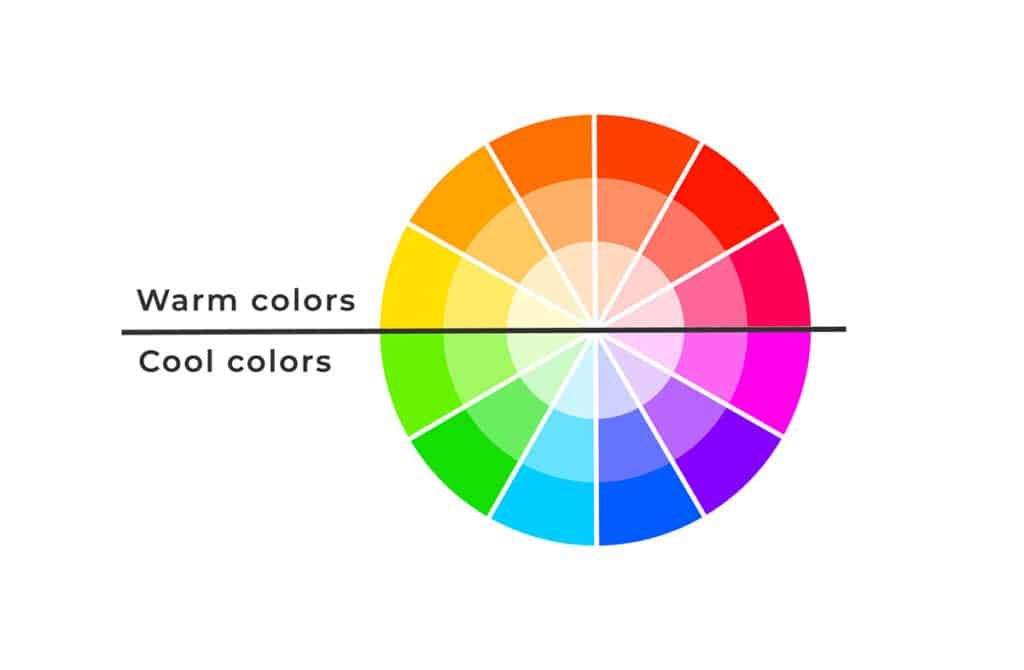
Color Temperature
Color temperature refers to how warm or cool a color appears. Warm colors like red, orange, and yellow evoke feelings of warmth, energy, excitement and joy. Cool colors like blue, green and purple feel more calming, peaceful and sophisticated.
Warm colors tend to advance visually, making objects seem closer. Cool colors recede visually, making objects seem farther away. Using warm colors for foreground elements and cool colors for background elements creates depth and visual interest.
When choosing color temperature, consider the desired mood. Warm hues express passion, playfulness and high energy. Cool hues convey tranquility, spirituality and melancholy. Combining warm and cool colors provides visual balance.
Value
Value refers to the lightness or darkness of a color in pixel art. Using variations in value is important for creating the illusion of form and depth in pixel art. Darker values recede into the background, while lighter values come forward. Strategic use of value establishes focal points and directs the viewer’s eye through the composition.
When working with a limited color palette, value becomes even more crucial. Shifting colors to darker or lighter shades creates contrast and visual interest. Subtle value shifts can be used to round shapes and show lighting effects. High contrast between light and dark makes elements pop. Large areas of medium values create dull, muddy images without clear focal points.
It’s important to plan value early when starting a pixel art piece. Begin by establishing the full value range, from black to white. Then allocate values to key elements, making sure there is adequate contrast between areas. Building value structure first provides an underlying foundation before applying color.
Mastering value in pixel art may be challenging at first compared to painting. But learning to see and manipulate values ultimately gives pixel art its dynamism. With practice, value control allows creating stylized lighting, dimension, and focus that makes pixel art visually striking. Mastering value makes the difference between flat, amateur pixel art versus professional, emotive pieces that engage viewers.
For more tips on using value effectively in pixel art, check out this excellent guide: [url1]
Saturation
Saturation refers to the intensity of a color. Highly saturated colors are very vivid and bright, while colors with low saturation are more muted and grayish.
In pixel art, controlling the saturation allows you to create a wide range of effects. Vibrant, highly saturated colors tend to looks joyful and grab the viewer’s attention. Using muted, low saturation colors can create a more subtle, somber mood.
Adjusting saturation is an important technique for making elements pop or recede in your artwork. Boosting saturation on key focal points helps them stand out, while reducing saturation on secondary elements makes them fade into the background.
You can add intensity to colors by shifting them closer to their pure, saturated version on the color wheel. For example, muting a bright red towards maroon increases its saturation. On the other hand, softening the red by mixing in gray reduces its intensity.
Aim for a carefully balanced composition using both highly saturated and muted colors. This creates visual interest and depth. Be careful not to oversaturate too many elements at once, as this can look unnatural and visually overwhelming.
Context
How colors interact with each other is crucial in pixel art. The relationship between background and foreground colors dramatically affects the overall composition and visual impact. As one Reddit user pointed out, simplifying the background to a solid color makes foreground elements pop more. Highly detailed or busy backgrounds distract the eye and make it harder for the main subjects to stand out.
Choosing complementary background and foreground colors creates strong visual contrast. For example, a bright character against a dark background immediately draws the viewer’s focus. The interplay between warm and cool colors also affects the mood and feel of a scene. A pixel artist must carefully consider context when selecting their palette to enhance their desired tone and direct the viewer’s eye.
Color and Emotion
Color can be a powerful way to evoke emotion in pixel art. The colors you choose in your palette convey a mood and feeling to the viewer. Here are some tips on using color to elicit specific emotional responses:
Warm colors like red, orange, and yellow can make a piece feel energetic, bold, or intense. Cool colors like blue, green, and purple can create a calming, serene feeling. For example, using a lot of bright, saturated warm colors could make a scene feel chaotic or alarming, while soft, dull cool colors could make it seem peaceful.
You can also use color to show contrasting emotions – a complementary color scheme with opposites on the color wheel, like red and green, can convey a sense of conflict or tension. And combining warm and cool colors in the same piece can be visually striking and create a complex mood.
Consider the context as well – a dark, muted color palette could represent sadness or fear, while bright, light colors may imply happiness and energy. Pay attention to the colors used in similar real-world scenes that evoke certain feelings. For example, a bright, vibrant sunset tends to feel warm, awe-inspiring and romantic.
It can help to look at art history and color theory resources to see how great artists use color to evoke emotion. With some experimentation and practice, you’ll develop intuition for how to use your pixel art colors to create the desired mood.
Reference: https://www.pinterest.com/pin/639581584606692420/
Mastering Color
Learning color theory takes time and practice. Here are some tips for mastering color as a pixel artist:
Start by learning the basics of primary, secondary and tertiary colors. Understand how colors relate to each other on the color wheel. Refer to resources like Color Theory for Pixel Artists: It’s All Relative to deepen your knowledge.
Experiment with different color palettes using tools like Lospec’s palette generator. Try palette swapping to see how different color schemes change the mood of your art.
Study pixel art from other artists and take note of how they use color. Deconstruct their techniques to add more tools to your toolkit. Look for examples online or in books like The Masters of Pixel Art.
Set time aside regularly to practice color use. Start with simple studies like shading a cube. Move up to more complex subjects once you have the basics down.
Get feedback from other pixel artists through online communities. Ask about areas you’re struggling with or share your art to get constructive critiques.
Don’t be afraid to experiment and make mistakes. Learning color theory takes time. With regular practice and study, you’ll gain an intuitive understanding over time.